How to Read Histograms: 9 Steps
Histograms are graphical representations of data distributions, offering a visual way to analyze numerical information. Used in various fields like finance, economics, and statistics, histograms are powerful tools that can help you make informed decisions. Here is a step-by-step guide on how to read histograms:
1. Understand the purpose of a histogram – A histogram aims to provide an overview of the distribution, revealing patterns within the data such as the central tendency, dispersion, and skewness.
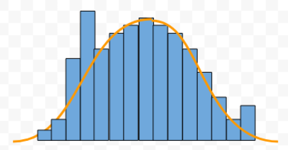
2. Identify the axes – On a histogram, the x-axis (horizontal axis) represents bins or intervals into which data is grouped, while the y-axis (vertical axis) represents frequencies or counts of data points within each bin.
3. Examine the bins – Bins are intervals created by dividing the entire range of values in the dataset into smaller ranges or categories. Check for uniformity in bin widths and notice how many bins are used in total.
4. Analyze bin frequencies – Observe how many data points fall within each bin by studying column heights. This will help you understand the concentration of data in specific intervals.
5. Assess the central tendency – Locate where most of your data points lie by identifying peaks (modal regions) within your histogram. Ideally, these should align with measures of central tendency such as mean and median.
6. Evaluate dispersion – Dispersion refers to the spread of your data across bins. Notice how far values are scattered around their average through range, variance, or standard deviation measures.
7. Look for symmetry – A histogram may be symmetrical if both halves appear similar when split along its peak. Symmetrical distributions typically indicate normality and can be useful when running statistical tests.
8. Identify deviations – Asymmetries (skewness) are often detectable in histograms with long tails extending either left (negatively skewed) or right (positively skewed). Additionally, gaps and spikes may suggest the presence of unusual values or anomalies.
9. Compare histograms – If you have multiple datasets, comparing their histograms side-by-side can help detect differences in data distributions and overall trends.
After spending some time studying histograms, you’ll begin to appreciate their efficiency and simplicity when analyzing large datasets. Applying these nine steps will enhance your ability to interpret and communicate the insights garnered from histograms effectively.